
0011.digital can design, build, and optimize Unbounce landing pages for your campaigns, including setup, integrations, and A/B testing.
Contact us.You’re looking to build landing pages that actually work, right? This guide will show you exactly how to use Unbounce to make pages that get results. We’ll cover everything from the basics of setting up your account to using advanced features that can seriously boost your conversions. Think of this as your roadmap to making every visitor count.
Key Takeaways
- Start with Unbounce’s pre-built templates to quickly set up your first landing page and get a feel for the interface.
- Focus on clear, persuasive copy and strong calls to action to guide visitors toward your goal.
- Optimize your pages for speed and mobile devices, as these factors greatly influence conversion rates.
- Use features like A/B testing and dynamic text replacement to continually improve page performance.
- Analyze your landing page metrics to understand what’s working and make data-driven decisions for future improvements.
Getting Started With Unbounce
Welcome to Unbounce! This platform is designed to help you create landing pages that actually work, meaning they bring in leads and customers. It might seem a bit much at first, but we’ll break it down so you can get going.
Understanding the Unbounce Interface
When you first log in, you’ll see a dashboard. Think of it as your command center. From here, you can access all the tools you need to build, manage, and track your landing pages. You’ll find sections for creating new pages, viewing your existing ones, and checking out your analytics. It’s pretty straightforward once you get the hang of it. The main areas to focus on initially are the page builder and the template library.
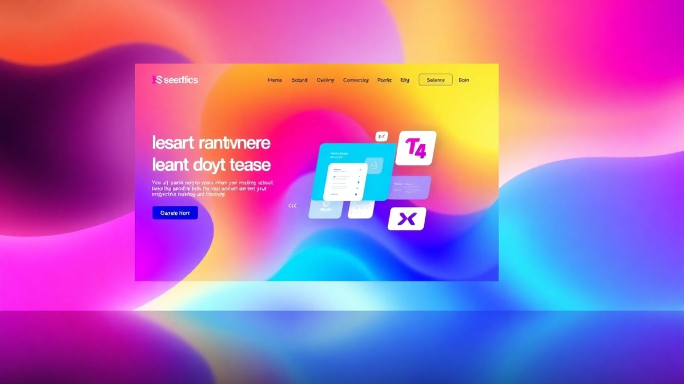
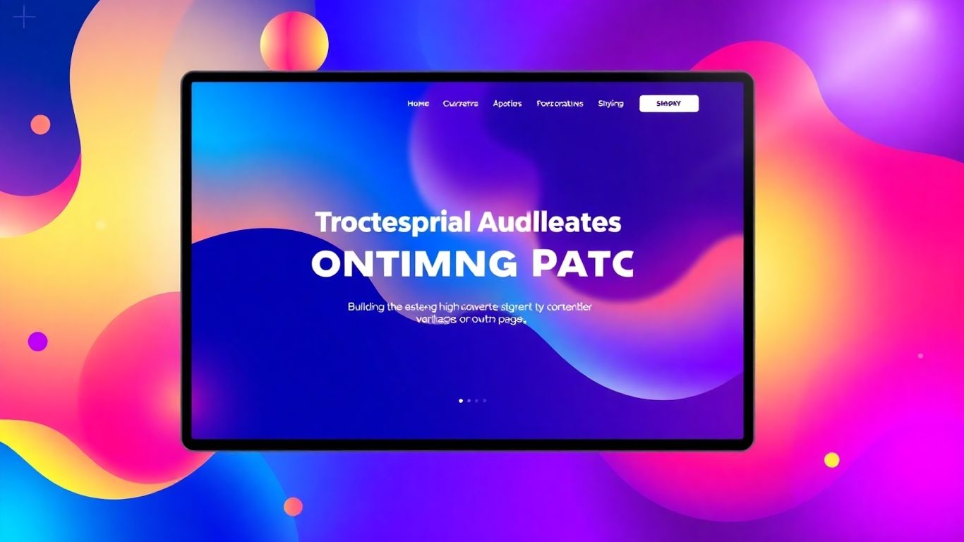
Leveraging Pre-Built Templates for Success
Starting from a blank page can be tough. Unbounce offers a wide variety of templates that have already been designed with conversion in mind. These aren’t just pretty designs; they’re built based on what tends to work well for getting people to take action. You can filter these templates by industry or goal, like lead generation or sales. Choosing a template that’s close to what you need can save you a lot of time.
Here’s a quick look at how templates can help:
- Save Time: Skip the design and layout work.
- Proven Designs: Use layouts tested for effectiveness.
- Inspiration: Get ideas for your own page structure.
- Faster Launch: Get your campaign live sooner.
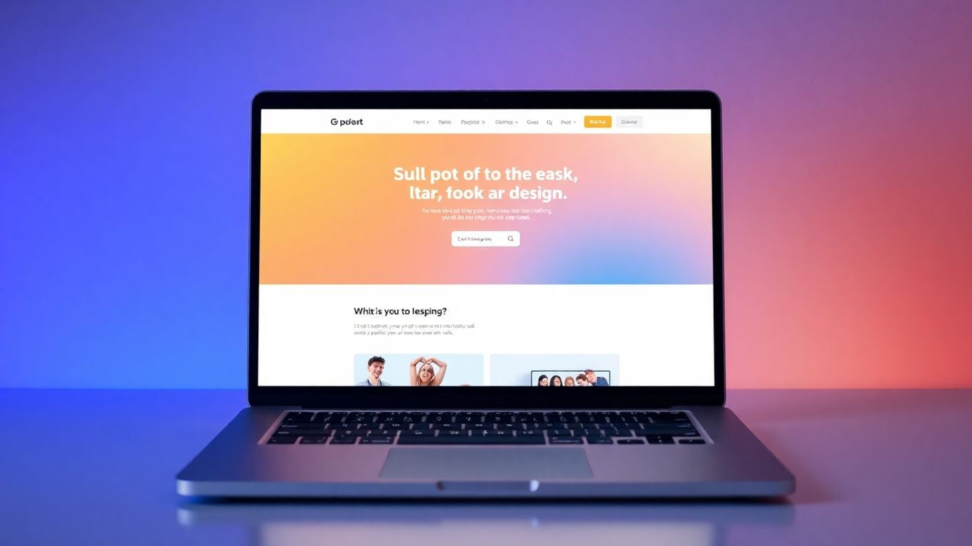
Setting Up Your First Landing Page
Once you’ve picked a template, it’s time to make it your own. The drag-and-drop editor makes this process quite simple. You can click on any element – text, images, buttons – and change it. Think about what you want your visitor to do. Is it to sign up for a newsletter, download a guide, or buy a product? Make sure your page clearly guides them toward that single goal. Don’t try to do too many things at once; focus on one main action.
Keep your landing page focused. If you’re asking for an email signup, don’t also try to sell them a product on the same page. Too many choices can confuse visitors and lead them to leave without doing anything.
Crafting High-Converting Landing Page Content
Once you have the basic structure of your landing page in place, it’s time to focus on what truly makes it work: the content. This is where you connect with your audience, explain your offer, and guide them toward taking the desired action. It’s not just about filling space; it’s about strategic communication.
Writing Persuasive Copy That Resonates
Your words need to do a lot of heavy lifting. They need to grab attention immediately, clearly explain the value you provide, and convince visitors that your offer is the right solution for them. Think about what your audience cares about and speak directly to their needs and desires. The goal is to make your visitor feel understood and to present your solution as the obvious next step.
Here are some ways to make your copy more effective:
- Highlight your unique selling proposition (USP) prominently. What makes you different and better than the competition? Make this clear right away, ideally above the fold.
- Focus on benefits, not just features. Instead of saying "Our software has X feature," explain how that feature will solve a problem or improve the user’s life, like "With X feature, you’ll save 5 hours a week."
- Use clear and concise language. Avoid jargon or overly technical terms that might confuse your audience. Keep sentences relatively short and to the point.
- Tell a story. People connect with narratives. Frame your offer in a way that tells a story about the problem and how your solution provides a happy ending.
Every element on your landing page should serve a single purpose: guiding the visitor toward conversion. If something doesn’t contribute to that goal, it’s likely a distraction.
Designing Effective Calls to Action
The Call to Action (CTA) is arguably the most important element on your landing page. It’s the button or link that tells visitors exactly what you want them to do next. A weak CTA can kill conversions, even if the rest of your page is strong. You want your CTA to be clear, compelling, and action-oriented.
Consider these points for your CTAs:
- Use action verbs. Instead of generic phrases like "Submit," try "Get Your Free Guide," "Start Your Trial," or "Download Now."
- Communicate value. Let visitors know what they’ll get by clicking. For example, "Claim Your Discount" is more enticing than just "Click Here."
- Make it visually distinct. Your CTA button should stand out from the rest of the page design with contrasting colors and clear sizing.
- Personalize the language. Using words like "your" can make the CTA feel more direct and relevant to the individual visitor, such as "Start Growing Your Business."
Integrating Visuals to Capture Attention
While copy is king, visuals play a massive role in keeping visitors engaged and conveying information quickly. High-quality images or videos can break up text, illustrate your points, and evoke emotion. The right visuals can significantly boost how quickly your message is understood and how memorable your offer becomes.
Think about how visuals can support your content:
- Use relevant imagery. Photos or graphics should directly relate to your product, service, or the problem you solve. Stock photos can work, but custom imagery often performs better.
- Show, don’t just tell. A product image or a short demo video can often explain your offering more effectively than a lengthy description.
- Maintain brand consistency. Ensure your visuals align with your overall brand aesthetic and tone.
Remember, your landing page is a carefully constructed environment designed to lead visitors to a specific action. By focusing on persuasive copy, clear calls to action, and supportive visuals, you create a compelling experience that drives conversions. For help with creating visually appealing and high-performing web pages, you might explore services that focus on custom website design.
Optimizing Your Landing Pages for Performance
Once you’ve built your landing page, the work isn’t quite done. To really make it work for you, you need to make sure it’s performing at its best. This means paying attention to how quickly it loads and how it looks and works on different devices, especially phones. You also want to make sure the message on your page matches what people saw in the ad that brought them there. Getting these things right can make a big difference in how many people actually do what you want them to do on your page.
Ensuring Lightning-Fast Page Load Speeds
People are impatient online. If your landing page takes too long to load, visitors will just leave. We’re talking about seconds here. A slow page can really hurt your conversion rates. You can help speed things up by making sure your images aren’t too big and by cleaning up your page code. Unbounce helps with this automatically, so you don’t have to be a tech wizard to get good performance. It’s about making sure the page gets to the visitor quickly so they don’t get frustrated and leave before they even see what you have to offer. For more on making websites fast, you can check out WordPress website speed.
Designing for a Seamless Mobile Experience
Think about it: you don’t know if someone is looking at your page on a big computer screen or a small phone. That’s why your page needs to look good and work well on all devices. Mobile-first design isn’t just a trend anymore; it’s a standard part of creating landing pages. You want the experience to be the same, no matter what device someone is using. This means making sure text is readable, buttons are easy to tap, and everything fits without looking cramped. A page that’s hard to use on a phone will likely lose visitors.
Aligning Messaging With Your Ad Campaigns
This is often called "message match." When someone clicks on an ad, they have a certain expectation about what they’ll see on the other side. Your landing page needs to meet that expectation. If the ad promises a specific discount, the landing page should clearly show that discount. If the ad talks about a certain feature, that feature should be prominent on the page. When the message in your ad and the message on your landing page line up, it builds trust and makes it more likely that the visitor will take the desired action. It’s a simple idea, but it’s really effective for landing page success.
The goal is to create a smooth journey for the visitor from the moment they see your ad to the moment they convert on your page. Any disconnect in messaging can cause them to hesitate or leave.
Here are a few things to keep in mind for message match:
- Headline Consistency: Your landing page headline should echo the main promise or keyword from your ad.
- Visual Alignment: If your ad features a specific product image, use a similar or identical image on your landing page.
- Offer Clarity: Clearly state the offer, discount, or benefit mentioned in the ad.
- Keyword Relevance: Ensure the language used on the page reflects the search terms that triggered the ad.
Advanced Unbounce Features for Conversion Growth
Now that you’ve got the basics down, let’s explore some of the more advanced features Unbounce offers to really push your conversion rates higher. These tools can make a big difference when you’re looking to fine-tune your campaigns and get the most out of every visitor.
Implementing A/B Testing Strategies
A/B testing, also known as split testing, is a method of comparing two versions of a webpage against each other to determine which one performs better. In Unbounce, this is straightforward. You create a variation of your landing page, change one element (like a headline, an image, or a call-to-action button), and then let Unbounce split your traffic between the two versions. After a period, you can see which version leads to more conversions.
- Headline Variations: Test different ways of phrasing your main message.
- Call-to-Action Buttons: Experiment with button text, color, and placement.
- Form Fields: See if reducing or changing form fields impacts submission rates.
- Images or Videos: Determine which visuals capture attention more effectively.
The goal is to make data-driven decisions, not just guesses, about what works best for your audience.
0011.digital can design, build, and optimize Unbounce landing pages for your campaigns, including setup, integrations, and A/B testing.
Contact us.Remember, you don’t need to test everything at once. Start with the most impactful elements of your page, like your headline or your main offer. Small changes can sometimes lead to surprisingly large improvements.
Utilizing Dynamic Text Replacement
Dynamic Text Replacement (DTR) is a powerful feature that helps you create a more personalized experience for your visitors by matching the text on your landing page to the keywords used in the ad they clicked. This alignment builds trust and relevance, which can significantly boost conversion rates. For instance, if someone clicks an ad for "blue running shoes," DTR can automatically change the headline on your landing page to "Blue Running Shoes" instead of a generic "Shop Our Footwear."
This is particularly useful when running campaigns across many different keywords or ad groups. Instead of creating a unique landing page for every single ad variation, you can use DTR to make one page feel highly specific to each visitor’s search query. This is a key part of making your landing page content feel directly relevant to the ad that brought the visitor there.
Leveraging Exit-Intent Popups for Win-Backs
Not every visitor who lands on your page is ready to convert immediately. Some might be comparison shopping, get distracted, or simply aren’t convinced yet. Exit-intent popups are designed to catch these visitors just as they’re about to leave your site. When Unbounce detects that a visitor’s mouse is moving towards the top of the browser window (indicating an intent to leave), a popup can appear.
These popups are a fantastic opportunity to make a final offer or capture contact information before the visitor is gone for good. You could offer a discount, a free resource, or a reminder of your product’s benefits. It’s a last-chance effort to salvage a potential conversion or at least add them to your email list for future follow-up, much like how automating sales processes can help keep deals moving forward.
Building Trust and Credibility
Showcasing Social Proof and Testimonials
People are more likely to trust a business when they see that others have had positive experiences. Think about it – when you’re looking for a new restaurant or a service, don’t you check the reviews first? Your landing page visitors do the same thing. Showing them that other people like and use your product or service can make a big difference.
Here are a few ways you can show off that positive feedback:
- Customer Reviews and Quotes: Displaying actual comments from happy customers can be very persuasive. Research suggests that good reviews can really boost conversion rates. Try to pick quotes that highlight specific benefits or solve a common problem.
- Social Media Mentions: If people are talking positively about you on social media, share it! A screenshot of a glowing tweet or a mention from an influencer can add a lot of weight.
- Case Studies: For more complex products or services, a short case study can be incredibly effective. It shows how you’ve helped someone else achieve a specific result, which can be much more convincing than just making a claim.
People often look for validation from others before making a decision. Your landing page is a prime spot to provide that validation, making visitors feel more secure about taking the next step.
Simplifying Page Design to Avoid Distractions
Your landing page has one main goal: to get the visitor to take a specific action, like clicking a button or filling out a form. Every single thing on that page should help with that goal. If something doesn’t directly contribute to the desired outcome, it’s probably best to leave it off.
Consider this: studies have shown that the more links you have on a landing page, the lower the conversion rate tends to be. It’s like having too many doors in a room – people get confused about where to go. Make sure every element on your page guides the visitor smoothly toward your call to action.
Providing Clear Signposts for Navigation
Even though you want to keep your landing page simple, you still need to make it easy for visitors to understand what’s happening and what they should do next. Clear signposts help people feel comfortable and confident as they move through your page.
- Obvious Calls to Action (CTAs): Your main CTA button should stand out. Use contrasting colors and clear, action-oriented text (like "Get Your Free Trial" or "Download Now").
- Logical Flow: Arrange your content in a way that makes sense. Start with a hook, explain the benefits, provide proof, and then present the CTA. This creates a natural progression for the visitor.
- Minimal Form Fields: If you’re asking for information, only ask for what you absolutely need. Long forms can be intimidating and cause people to leave before they even start. Think about what’s truly necessary to move them to the next stage.
Analyzing and Refining Your Efforts
Now that you’ve built your landing pages and put them out there, it’s time to look at how they’re actually doing. This isn’t a ‘set it and forget it’ kind of deal. You need to keep an eye on things and make smart changes. Think of it like tending a garden; you water, you weed, and you prune to help things grow.
Understanding Key Landing Page Metrics
To know if your pages are working, you need to look at the numbers. These metrics tell you what’s happening and where you might have problems. It’s not about just looking at one number, but how they all fit together.
- Conversion Rate: This is probably the most important one. It tells you what percentage of visitors actually did what you wanted them to do, like filling out a form or making a purchase. A higher rate means your page is doing a good job.
- Click-Through Rate (CTR): This shows how many people clicked on your ad or link that led them to your page. A good CTR means your ad is grabbing attention and is relevant.
- Bounce Rate: This is the percentage of visitors who leave your page without interacting with it at all. A high bounce rate might mean the page isn’t what they expected, or it’s not engaging enough.
- Average Order Value (AOV): If you’re selling something, this tells you how much people are spending on average per order. You might want to increase this over time.
- Cost Per Click (CPC): This is how much you pay for each click on your ads. You want to make sure your conversions are worth this cost.
Using Data to Guide Your Decisions
Looking at these numbers is just the first step. The real work is figuring out what they mean and what to do about them. For example, if your conversion rate is low, you need to ask why.
Is the offer not clear? Is the form too long? Is the page design confusing? Or maybe the traffic you’re getting isn’t the right kind of traffic for your offer?
Here’s how you can start digging into the data:
- Map the Customer Journey: Understand all the steps a visitor takes from seeing your ad to becoming a customer. Look for where people drop off.
- Analyze Traffic Sources: See which places your visitors are coming from (e.g., Google Ads, social media, email). Some sources might send you better-quality visitors than others.
- Segment Your Audience: If possible, look at how different groups of people interact with your page. Do younger visitors behave differently than older ones? Do people from different locations convert at different rates?
- Review Ad Campaigns: Check if your landing page message matches what your ads are promising. If they don’t line up, people will leave.
Continuous Improvement Through Testing
Once you have an idea of what might be wrong, you need to test changes. You can’t just guess; you need to see if your ideas actually make things better. This is where A/B testing comes in handy, which you’ll learn more about in the next section.
Think about making one change at a time. For instance, try a different headline, a new button color, or a shorter form. Then, let the test run long enough to get meaningful results. Compare the performance of the original page (the ‘A’ version) against the new version (the ‘B’ version). The version that performs better is the one you should use. This ongoing process of testing and refining is how you keep making your landing pages work harder for you.
Putting It All Together
So, you’ve learned a lot about making landing pages that work. We’ve gone over how to get people to your page, what to put on it to make them want to click, and how to make sure they have a good experience. Remember, it’s not just about building one page and being done. It’s about testing things out, seeing what works best for your specific audience, and making changes as you go. Unbounce gives you the tools to do all of this, from creating the pages themselves to testing different versions. Keep practicing, keep learning from your results, and you’ll get better at creating pages that really convert. You’ve got this!
Frequently Asked Questions
What is Unbounce and why should you use it?
Unbounce is a tool that helps you create special web pages, called landing pages. These pages are designed to get visitors to take a specific action, like signing up for something or buying a product. You should use Unbounce because it makes it easy to build these pages, even if you’re not a web designer, and it helps you get more people to do what you want them to do.
How do I start using Unbounce to make my first landing page?
To begin, you’ll want to explore the Unbounce dashboard to get familiar with its tools. Unbounce offers many ready-made designs, called templates, that you can pick from. Choose a template that looks good and fits what you need, then start customizing it with your own words and pictures to make it yours.
What makes a landing page effective for getting people to act?
An effective landing page has clear and convincing words that tell people why they should care. It also has a strong call to action, which is like a button or link that tells them exactly what to do next. Good pictures and easy-to-understand information also help grab attention and make people feel confident.
How can I make sure my Unbounce landing page works well on phones and tablets?
When you build your page in Unbounce, you can see how it looks on different devices, like phones and computers. It’s important to make sure your page looks good and is easy to use on smaller screens, because many people will visit your page using their phones. This means making sure text is readable and buttons are easy to tap.
What is A/B testing, and how can it help my landing pages?
A/B testing is like trying out two different versions of your landing page to see which one works better. For example, you might change the color of a button or the words in a headline. Unbounce lets you easily test these different versions. By seeing which version gets more people to take action, you can learn what your audience likes best and make your page even more successful.
How do I know if my landing page is doing a good job?
You can track important numbers, like how many people visit your page and how many of them actually take the action you want them to. Unbounce provides tools to see these numbers. By looking at this information, you can understand what’s working well and what could be improved, helping you make your landing pages better over time.
0011.digital can design, build, and optimize Unbounce landing pages for your campaigns, including setup, integrations, and A/B testing.
Contact us.