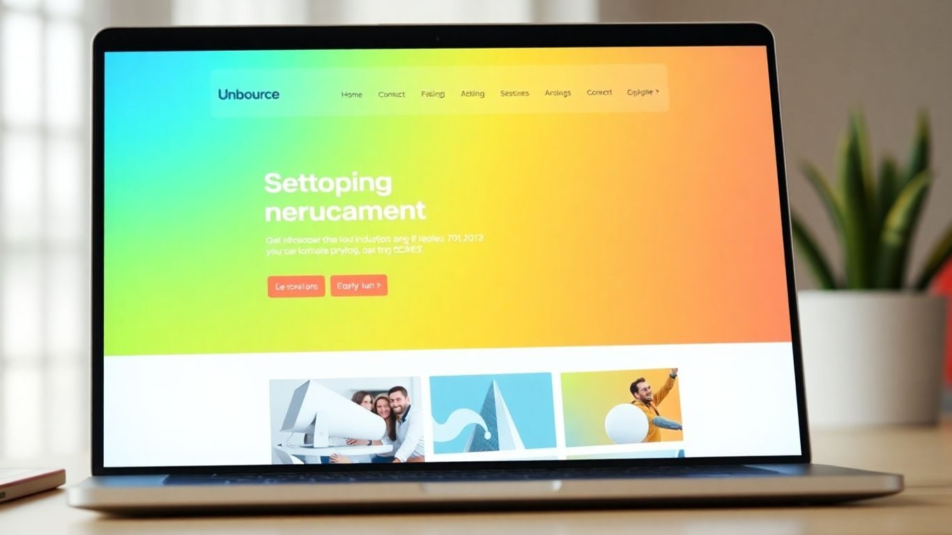
0011.digital can design, build, and optimize Unbounce landing pages for your campaigns, including setup, integrations, and A/B testing.
Contact us.Building effective Unbounce landing pages can feel like a puzzle. You want visitors to see your offer, understand it, and then take that all-important next step. It’s not just about making a page that looks good; it’s about making a page that works hard for you. We’ll look at how to put together Unbounce landing pages that really connect with people and get them to act. Think of it as setting up a clear path for your visitors, from the moment they arrive to when they become a lead or customer.
Key Takeaways
- When you’re making Unbounce landing pages, start with a headline that grabs attention right away and copy that clearly tells people what’s in it for them. Make sure your ‘call to action’ button is easy to see and understand.
- Make sure your Unbounce landing pages work well on phones and tablets. They should also load quickly and have a simple, clean look so visitors aren’t confused.
- Use things like customer reviews or limited-time offers to make people feel more confident and encourage them to take action on your Unbounce landing pages.
- Don’t just guess what works best. Test different parts of your Unbounce landing pages, like headlines or button colors, to see which versions get more people to convert.
- Keep an eye on how your Unbounce landing pages are doing using analytics tools. Look at the numbers to see what’s working and what’s not, then make changes to improve them over time.
Crafting Compelling Unbounce Landing Pages
Your Unbounce landing page is often the first real interaction a potential customer has with your brand or offer. It needs to grab their attention right away and clearly communicate what you’re offering and why they should care. Think of it as your digital handshake – it needs to be firm, friendly, and make a good impression.
Develop Headlines That Captivate
The headline is the very first thing someone sees, so it has to work hard. It needs to be clear, concise, and immediately tell the visitor what they’ll get. A good headline isn’t just descriptive; it sparks curiosity or highlights a key benefit. For instance, instead of "Our New Software," try something like "Save 5 Hours a Week on Data Entry." It’s specific and speaks directly to a common pain point.
- Be direct: State the main benefit upfront.
- Spark interest: Use numbers or intriguing questions.
- Align with ads: Make sure it matches the ad the visitor clicked.
Write Clear and Benefit-Driven Copy
Once you’ve got their attention with the headline, your copy needs to keep it. People are looking for solutions to their problems or ways to improve their lives. Your text should focus on the benefits of your offer, not just the features. How will it make their life easier, better, or more enjoyable? Use simple language; avoid jargon that might confuse your audience. Short paragraphs and bullet points make the information easier to digest quickly.
Focus on what the visitor gains. Frame your product or service in terms of the positive outcomes it provides. This approach helps visitors quickly see the value and relevance to their own needs.
Design a Strong and Prominent Call-to-Action
What do you want the visitor to do after reading your page? Whether it’s signing up, downloading a guide, or making a purchase, your Call-to-Action (CTA) needs to be obvious. Use action-oriented words like "Get Your Free Trial" or "Download Now." The button should stand out visually, perhaps with a contrasting color, so it’s easy to spot. Don’t make visitors hunt for it; guide them clearly to the next step. A well-designed CTA is key to turning interest into action, and it’s something that 0011.digital excels at helping businesses define.
Here’s a quick look at what makes a good CTA:
- Visibility: It should be easy to find.
- Clarity: The action required is unmistakable.
- Compelling: It offers a clear benefit for clicking.
Optimizing Unbounce Landing Pages for User Experience
Making sure your Unbounce landing pages work well for everyone who visits is super important. If it’s clunky or slow, people will just leave. We want them to stick around and do what we want them to do, right?
Prioritize Mobile Responsiveness
Think about how many people look at websites on their phones these days. It’s a lot. If your landing page looks weird or is hard to use on a small screen, you’re probably losing a bunch of potential customers. You need to make sure your page looks good and works perfectly on any device, from a big desktop monitor to a tiny smartphone screen. This means using responsive design, which automatically adjusts the layout based on the screen size. It’s not just about looks, either; it’s about making it easy for people to click buttons and read your text without pinching and zooming all the time. A good mobile experience is key to keeping visitors engaged.
Ensure Fast Loading Speeds
Nobody likes waiting for a page to load. Seriously, if your page takes more than a few seconds, people will hit the back button. This is especially true on mobile where connections can be spotty. To speed things up, you can try things like compressing your images, using browser caching, and making sure your code is clean. There are tools out there that can help you figure out what’s slowing your page down. Getting your page to load quickly is a big win for user experience and can really help with your search engine rankings.
Implement a Clean and Minimalist Design
Clutter is the enemy of conversion. When a landing page is packed with too much stuff – too many words, too many images, too many options – it can overwhelm visitors. They won’t know where to look or what to do. A clean, minimalist design helps guide the visitor’s eye directly to what matters most: your offer and your call to action. Think about using plenty of white space, clear typography, and only including elements that directly support your page’s goal. It makes the whole experience feel more professional and less stressful for the user.
Establish Clear Visual Hierarchy
Visual hierarchy is basically how you arrange elements on the page to show their order of importance. You want the most important things to stand out. This usually means your headline should be the biggest and most prominent, followed by your main offer or benefit, and then your call-to-action button. Using size, color, and placement strategically helps people scan your page quickly and understand what you’re offering without having to read every single word. It’s like using signposts to guide someone through a new city; it makes the journey much easier.
A landing page that’s difficult to use or understand will fail, no matter how great your offer is. Focus on making it as simple and intuitive as possible for the visitor.
Here’s a quick rundown of what to focus on:
- Mobile-first approach: Design with mobile users in mind from the start.
- Speed optimization: Compress images and streamline code for faster load times.
- Declutter: Remove unnecessary elements and use white space effectively.
- Guide the eye: Use visual cues to direct attention to key information and the CTA.
By paying attention to these user experience factors, you’re building a better foundation for your Unbounce campaigns. It’s all about making it easy and pleasant for people to interact with your brand. If you’re building custom websites, a solid foundation is important, and services like WordPress website development can help with that.
Leveraging Psychology to Boost Unbounce Landing Page Conversions
People don’t just click buttons; they respond to feelings and motivations. Understanding a bit about how people think can really help you design landing pages that get more people to take the action you want. It’s not about tricking anyone, but about presenting your offer in a way that makes sense and feels right to them.
Incorporate Social Proof and Testimonials
Think about it: when you’re looking for a new restaurant or a service, you often check reviews first, right? People tend to trust what others say more than what a company says about itself. This is where social proof comes in handy.
- Displaying testimonials from happy customers. Make sure these feel real – include names, maybe even a photo if possible. This builds trust.
- Showing logos of companies you’ve worked with. If you’ve helped well-known brands, showing their logos can make a big impression.
- Highlighting user numbers or positive statistics. For example, "Join over 10,000 satisfied users" can be quite persuasive.
People are more likely to believe in your product or service if they see that others have already found success with it. It reduces the perceived risk for new visitors.
Utilize Urgency and Scarcity Tactics
Sometimes, people need a little nudge to make a decision. Urgency and scarcity play on the natural human tendency to not want to miss out (FOMO – Fear Of Missing Out).
- Limited-time offers: Use countdown timers to show when a special deal will end. This encourages immediate action.
- Limited quantity: If you have a product with limited stock, letting people know can prompt them to buy before it’s gone. For instance, "Only 5 left in stock!"
- Exclusive access: Offer something that’s only available for a short period or to a select group.
Personalize Content for Your Audience
Generic messages often get ignored. When you can make your landing page feel like it’s speaking directly to the visitor, you’ll see better results. Personalization shows you understand their specific needs.
- Tailor content based on where they came from. If someone clicked an ad for a specific product, make sure the landing page talks about that product prominently. You can use tools to help with keyword research to understand what terms people are searching for.
- Use dynamic text. If you know a visitor’s name or company, you can insert it into the page copy or headline.
- Segment your audience. Create slightly different versions of your landing page for different customer groups, highlighting the benefits most relevant to each.
By applying these psychological principles, you can transform your Unbounce landing pages from simple information displays into powerful conversion tools.
Mastering A/B Testing for Unbounce Landing Pages
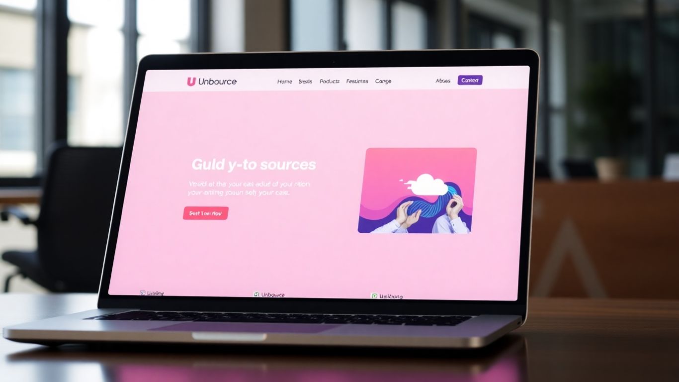
0011.digital can design, build, and optimize Unbounce landing pages for your campaigns, including setup, integrations, and A/B testing.
Contact us.So, you’ve put together a landing page in Unbounce that looks pretty good. But how do you know if it’s actually working as well as it could be? That’s where A/B testing, or split testing, comes in. It’s your secret weapon for figuring out what really makes your visitors tick and, more importantly, what gets them to convert.
Identify Key Elements for Testing
Before you start changing things randomly, you need to know what to test. Think about the parts of your landing page that have the biggest impact on whether someone takes action. These are often the elements that directly influence a visitor’s decision.
- Headlines: This is the first thing people see. Does it grab attention? Does it clearly state the benefit?
- Call-to-Action (CTA) Buttons: The text, color, size, and placement of your CTA button can make a huge difference.
- Form Fields: How many fields are you asking for? Too many can scare people away.
- Images and Videos: Do your visuals support your message and appeal to your audience?
- Body Copy: Is your message clear, concise, and benefit-focused?
It’s best to focus on testing one element at a time. If you change too many things at once, you won’t know which change actually caused the difference in results.
Implement Split Testing Strategies
Once you’ve picked an element to test, it’s time to set up your experiment. Unbounce makes this pretty straightforward. You’ll create a variation of your original page (the ‘control’) that only differs in the one element you’re testing (the ‘challenger’). Then, you’ll direct traffic to both versions simultaneously.
Here’s a basic approach:
- Formulate a Hypothesis: Before you test, make a guess about what you think will happen. For example, "Changing the CTA button color from blue to orange will increase clicks because orange stands out more." This gives your test direction.
- Set Up the Test: In Unbounce, create a duplicate of your landing page. Make the single change you want to test. Then, use Unbounce’s A/B testing feature to split your traffic between the original and the new version.
- Run the Test: Let the test run long enough to gather meaningful data. This usually means waiting until you have a statistically significant number of visitors and conversions for both versions. Don’t stop the test too early, or your results might just be due to random chance.
The goal of A/B testing isn’t just to see which version wins, but to learn why it wins. This learning is what helps you improve future pages.
Analyze Results and Iterate
After your test has run its course, it’s time to look at the numbers. Unbounce will show you which version performed better in terms of conversions. But don’t just stop there.
Consider these points:
- Conversion Rate: Which version led to more people completing your desired action?
- Statistical Significance: Are the results reliable, or could they be due to chance?
- Visitor Behavior: If possible, look at how visitors interacted differently with each version. Did they spend more time on one? Did they click on different elements?
Based on your findings, you’ll decide which version to implement as your new control. Then, you can start thinking about the next element you want to test. Continuous testing and refinement are how you turn a good landing page into a great one that consistently drives results.
Analyzing Performance and Continuous Improvement

You’ve put in the work to design and optimize your Unbounce landing pages, but the job isn’t quite done yet. Think of it like tending a garden; you plant the seeds, water them, and then you keep an eye on them to make sure they’re growing well and adjust as needed. That’s where analyzing performance and committing to continuous improvement comes in. It’s how you turn a good landing page into a great one, and a great one into a conversion machine.
Track Essential Conversion Metrics
To know if your landing pages are actually doing their job, you need to look at the numbers. These aren’t just random figures; they tell a story about how people are interacting with your page. Keeping an eye on these key metrics will give you a clear picture of what’s working and what’s not.
- Conversion Rate: This is the big one. It’s the percentage of visitors who complete your desired action, whether that’s signing up for a newsletter, downloading an ebook, or making a purchase. A higher conversion rate means your page is doing a better job of persuading visitors.
- Bounce Rate: If visitors land on your page and leave immediately without clicking on anything, that’s a bounce. A high bounce rate can signal that your page isn’t meeting visitor expectations, or perhaps the traffic you’re sending isn’t the right fit.
- Average Time on Page: How long are people actually spending on your page? If it’s very short, they might be skimming or not finding what they need. A longer time could mean they’re engaged, but you’ll want to cross-reference this with your conversion rate.
- Click-Through Rate (CTR): This specifically measures how many people click on your call-to-action buttons. A low CTR might mean your CTA isn’t prominent enough, or the wording isn’t compelling.
Utilize Analytics and Heatmap Tools
Numbers are great, but sometimes you need to see how people are interacting with your page to really understand the data. Tools can help you visualize user behavior in ways that raw analytics can’t.
- Google Analytics: This is your go-to for tracking traffic sources, user demographics, and overall site performance. You can set up goals to track specific conversions.
- Heatmaps (e.g., Hotjar, Crazy Egg): These visual tools show you where people are clicking, scrolling, and spending their attention on your page. You can quickly spot areas that are getting ignored or, conversely, areas that are attracting a lot of clicks.
- Session Recordings: Watching recordings of actual user sessions can be incredibly insightful. You can see firsthand where users get stuck, confused, or frustrated, providing direct clues for improvement.
Understanding user behavior goes beyond just looking at the final conversion number. It’s about observing the journey, identifying friction points, and seeing where attention naturally flows. This qualitative data often reveals the ‘why’ behind the quantitative metrics.
Refine Forms and CTAs Based on Data
Your forms and calls-to-action (CTAs) are the gateways to conversion. If they’re not working optimally, you’re leaving potential leads or sales on the table. Use the insights you’ve gathered from your analytics and heatmap tools to make targeted improvements.
- Form Fields: Are your forms too long? Are there fields that visitors consistently skip or abandon? Consider simplifying your forms to only ask for the most critical information.
- CTA Wording and Design: Does your CTA button stand out? Is the text clear and action-oriented? Test different colors, sizes, and phrases to see what encourages more clicks. For example, changing "Submit" to "Get Your Free Guide Now" can make a significant difference.
- Placement: Where is your CTA located on the page? Heatmaps can show you if users are even seeing it. Sometimes, moving a CTA higher up or adding a secondary one further down can improve performance.
Wrapping Up: Your Landing Page Success Plan
So, you’ve learned a lot about making landing pages that actually work. It’s not just about making something look pretty; it’s about understanding what makes people click and take action. We’ve talked about getting the basics right, like clear headlines and strong calls to action, and also looked at some more advanced tricks like A/B testing and making things personal for your visitors. Remember, this isn’t a one-time thing. The best landing pages are always being tweaked and improved. Keep an eye on your numbers, try new things, and don’t be afraid to learn from what doesn’t work. You’ve got the tools now to build pages that bring in results. Go out there and start converting!
Frequently Asked Questions
What is Unbounce, and why should you use it for landing pages?
Unbounce is a tool that helps you create special web pages, called landing pages. These pages are designed to get visitors to take a specific action, like signing up for something or buying a product. You should use Unbounce because it makes it easy to build these pages without needing to be a coding expert, and it helps you make them better over time to get more people to take action.
How do you create a headline that grabs attention on an Unbounce page?
To make a headline that people notice, you should make it short, clear, and exciting. Think about what the visitor will gain from your offer. Using strong words and clearly stating the main benefit helps capture their interest right away, making them want to learn more.
What makes a Call-to-Action (CTA) button effective?
An effective CTA button is easy to see and tells people exactly what to do. It should stand out on the page, perhaps with a bright color. The words on the button should be action-oriented, like ‘Get Your Free Guide’ or ‘Start Now,’ so visitors know what happens when they click.
Why is it important for Unbounce landing pages to work well on phones?
Many people use their phones to browse the internet. If your landing page doesn’t look good or work properly on a phone, visitors might leave without taking action. Making sure your page is mobile-friendly ensures everyone has a good experience, no matter what device they are using.
What does A/B testing mean for Unbounce landing pages?
A/B testing means creating two versions of your landing page that are almost identical, with just one small difference, like the color of a button or the wording of a headline. You then show each version to different visitors to see which one performs better. This helps you figure out exactly what changes will get you more results.
How can you tell if your Unbounce landing page is successful?
You can tell if your landing page is successful by looking at its conversion rate. This is the percentage of visitors who complete the action you want them to take. You should also watch other numbers, like how many people leave the page right away (bounce rate), to understand how visitors are interacting with your page and where you can make improvements.
0011.digital can design, build, and optimize Unbounce landing pages for your campaigns, including setup, integrations, and A/B testing.
Contact us.